Saturday, January 31, 2015

Illustrations using Adobe Illustrator

Purple Passion vine illustration using Adobe Illustrator


I have been illustrating in Adobe Illustrator for many years and after a many parts and end equipment I thought it was time to expand my subject matter. How I actually started working in the high-tech industry doing technical drawings and the occasional illustration was by showing an image of a green tree frog to a potential employer. It was the first attempt at illustrating using a PC-the program was Arts and Letters Jurassic Arts and the tools were basic at best.

I have since worked in Micrografix Designer, Corel Draw even freehand and finally the standard adobe products-Illustrator and Photoshop. After writing about the life of a goldfish I decided to illustrate the image instead of using a photograph and what follows is how I approach illustrating in Illustrator.

My first and most basic process is just getting the shape and basic colors and tones down. This is the fastest part of the illustration. I will usually follow the lines of color and shadow and create layers of light that cover up layers of shadow. 

Image 1-basic form
After I feel the overall form is correct I will layer the colors again almost like the rings of a tree-you overlap each color with the form that overlaps it. You will notice every change and try to process it as if there were multiple layers of shapes that make the final form. I try to use as little gradients as they can tend to be contrived-if I do use them they need to be very subtle.
The second figure shows a minimal change from the first. Basic overlaying of colors that allow the background to show through and adds depth to the illustration. Detail is not as important at this point as there will be overlying of details and softening of edges after this stage.

Image 2-overlays of colors-layering for effect

The third step is where all the details begin taking shape. Again hard edges are overlapped
with lighter softer edges. At this stage I need to realize the overall texture and the best
way to create a subtle dimensional feel to the image. 

Image 3-overlaying two

By the third step the most intricate color and details become the major focus. I start cleaning up the basic shape and making sure all the proportions are right. The lines and detail is severe at this point because with the next step I will use the brush to merge the shapes to form a subtle more photographic image.

The final step is actually using brush strokes to overlap the hard edges of the previous step. Light and shadow overlay the original details and blocks of colors with varying degrees of opacity allows for more subtle effects.
Final step before creating background
After finalizing the details and colors of the fish I create a background. I don't want much detail in the background so brush work and simple heavily feathered images create a backdrop that strives to not fight with the image of the goldfish.

Finished product using Adobe Illustrator
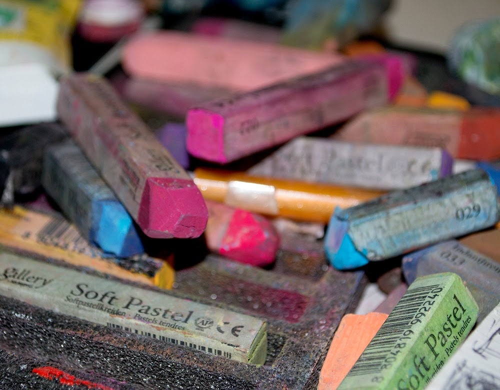
Please stay tuned for more how-to articles on illustrating in Illustrator and rendering in Photoshop as well as processes for oil and pastel artwork. I welcome your comments, requests and suggestions.


Saturday, January 10, 2015

Back to the canvas 2


I painted a commission today, a painting of blackbirds and a still life, also a commission. Again, I don't feel like I'm one hundred percent back in the zone but I have a clearer vision of what I want going forward. I feel like I have worked hard at realism, relaxed and became a bit more expressionistic and now I am back to basic skill of capturing images correctly.

I'm not saying I want to be super realistic but I do want more quality in the initial rendering. I want the feeling to be the strongest element of the painting but I still want the details to be evident to the viewer. I am planning on doing more en plain air painting in the near future as I believe there are so many elements you miss when you paint from memory or pictures.

On that note, I tried to paint a still life without any initial layout. It really is a freeing feeling to just paint without any guides. The image is in my mind but it is not completely clear. It is an exciting feeling to watch it become out of just a vague idea of a painting.

I'm looking forward to continuing to allow more time to paint and as I increase frequency I will get back into the zone where painting just seems effortless.

Sunday, January 4, 2015

Back to the Canvas


I went into the studio again today, first time in a long time. I have many paintings to do for commissions and many that have just got on the to-do list. I was excited and yet awkward the way I always seem to be when getting back to it.

Very exciting feeling when all of the paintings you pick up you actually have a  clearer vision than when you first started. Today I revamped an evening fountain painting and completely changed the whole color scheme. I changed up a cloud scene with blackbirds and blocked in the flock of birds on a wire.

Preliminary Pastel Sketch
Pastel Preliminary Sketch
It was a good day, very productive-under painted several paintings that were to be commissions that have lagged behind for far too long. I had that feeling that I knew where things were supposed to be but I also have a whole new perspective on the movement of paint, the way colors weave into the canvas and my perspective in general.

I almost feel like it was a practice run. Nothing amazing except the realization how much I've missed painting and how incredible it feels to be in the creative zone. I look forward to the next sitting.

I'm not sure what's coming up next but the brake from painting seems to have helped. I am excited for the creative inspiration      
                                                             to grow. I will keep you posted.


Sunday, December 21, 2014

The colors of the next few moments...It's all we have.


In the midst of winter-one last glimmer of spring-the seed of the nasturtium, out of the blue gray leaves, the dried up corpses of summer-out of the cold gray sky where no light escapes, not a bit of color nor trace of warmth-the nasturtium....Call it hope in the midst of darkness-one seed on the edge of days ending. Don't expect the rich orange blooms nor the seeds to germinate only enjoy this moment-the amazing hours where all the color exists and you taste it just like lemons in the spring. One short embrace of moments passing means everything.

Inspired by a friend who shows me color in the depths of winter...

Sunday, September 21, 2014

The first day of the creative spring

Cannas_from the Cape San Blas Series


I have been walking around in somewhat of a daize as of late. Ideas come in bits of clips, it’s almost like trying to build a house when all you have are screws and a couple of wooden boards-nothing materializes but the parts seem to overwhelm you. I should be patient by now having gone through this process for so many years but it seems the older I get the more profound and extreme the stages seem to be.

I have played with multiple ideas and images in my mind, stories and poems need to be written out in notes just to keep the initial inspiration but nothing gels. I have actually recently walked into my studio after insisting I was going to paint this  particular weekend and when I am faced with empty canvases or even canvases well on their way to something I stare vacantly with nothing there. I even try to rotate a canvas out for another and switch to pastel but then end is always the same-NOTHING.

I can even force myself through and get to that point of pushing paint around but it is like painting with no instructions. I have compared it to someone painting by numbers and suddenly all the lines and numbers disappear. Than there are days like yesterday-a painting that sat there staring back with discontent and suddenly we are on the same page again-or canvas. I almost equate the canvas like a teen that can’t explain what is bothering them and suddenly we have that cathartic talk and not only do I know what the problem is now I have a way to solve it.


Urban Sunset
I sat in front of four paintings for short bursts of time and than suddenly within hours I have several different clarified paths that actually seem to be heading in a great direction. The problem with the creative process is that tomorrow they can all seem like disasters-it’s almost like the creative eye opens and you can see the details that the logical eye seems unable or unwilling to connect. Suddenly the big blob of paint becomes the shadow that instinctively knew where it needed to fill and the form that seemed so cryptic previously lends itself to the correct perspective and the right hues and values. I am about to go in and paint again-not only has this weekend brought lots of painting but my words are actually falling off the page as well-in the creative realm it rains or it shines but oh when it shines it really seems more brilliant than  anything in comparison.

Carmens' Delicious Catering: Food as Art, Art as Food


Carmen’s Delicious Catering has this as a tag line for their product, it comes from the fact that during the process of the business becoming what it is today she had lots of interactions with artists such as the pilchuck glass school. In truth cooking in the hands of a passionate artist heightens simple food to the essence of a work of art.

Consider the cook as a painter only their palette has even more colors than the artist, their colors are the many flavors they weave together much like a painting-each flavor supporting or interacting with the other. The wonderful thing about food is beyond just the flavor there is texture, presentation and aromas-when done correctly the simple meal touches all parts of the senses even further than the two dimensional canvas.

The secondary dimension of food is much like the flavors in wine, the fact that you don’t only see, smell and taste-you experience. Food becomes the tradition; the amazing memory-it attaches itself to places and people.  Food reminds us of our relatives, it brings back conversation and a sense of tradition.


Food colors our vacations, our travels to far off places and instills itself in culture and tradition, Which brings us to another of carmens’ tag lines-Bringing people together through food-it is often the centerpiece for good times. It complements our celebrations and brings comfort to our difficult times, it is the warm soup after shoveling snow, and it is the cool ice tea and bowl of fruit in the heat of summer.  Speaking of the bowl of fruit, how many artists have painted the still life and showed us how food is art and art in response is food.

Saturday, September 20, 2014

The Still Life Painting-Memory versus Setup


I have never been much for the still life-I tend to paint landscapes, seascapes, anything nature oriented but recently because of Carmen’s’Delicious Caterings’ food as art and art as food tag line-the first of many still life became a necessary project.

It’s hard to paint on demand, for me anyway-I either feels it or not. The first painting was of a still life of an August picnic, complete with watermelon-kind of the centerpiece, grapes, tomatoes, peppers and the corn on the cob to finish off the picnic. I set up the still life on a wooden board and stared at it intently with nothing moving. It was one of the hardest paintings because it just didn’t do anything for me. I had the basic idea of the sky and the warm greens in the background and the foreground seemed to just lie there. All I can say is through discipline I found a place between capturing the still life as it is and weaving in my own feeling of the late August picnic seemed to fight against each other-logic and simple rendering fight as it always does with the creative and the figurative idea of the day. This is what I paint, even in the landscape-I rarely paint the place, it’s more the feeling of the place and usually when the logical rendering becomes stronger than the feeling of the place it seems colder to me.


The second in the series is an autumn gathering of pumpkins, squash and a cornucopia of good colors and flavors. Again the feeling of the sky was the first things that really jumped out at me and the under painting seemed to capture it so perfectly that it jump started the next step. This time I did not set up a still life-I gathered images and relied more on memory. The sudden and rich flow of paint seemed to surprise me. The painting pretty much did itself. The colors of autumn work so well against each other and the fact that I love the cool answer to summers’ heat seems evident in the way the painting took shape-also I must admit that the previous painting was done during a time of great creative block and this second in the series is at the beginning of the unraveling of my creative slump. Several other paintings began to take shape at the same time, but even still I weigh the difference between painting from passion and memory versus painting a set up still life and for me the memory works better than the real thing.